Do Mega Menus Negatively Effect SEO and Conversions
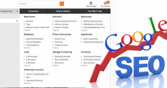
There has always been a butting of heads between User Experience Gurus, SEO Masters, & Frontend Developers on the subject of navigation and more so in recent years with the popularity of the ‘Mega Menu’.
The reason for this being a ‘touchy subject’ generally is because navigation needs to achieve so many crucial aspects of the structural, functional, & aesthetic goals of any website – especially on eCommerce website sites. Many online marketers knock Mega Menus as being horrible for SEO but in our opinion this is not always the case. Similar to most subjects in web design there are both positive’s and negative aspects to a subject so for us in teh case of a mega menu it’s working out which ones outweigh which for you and your site.
Below are some of the standard arguments to mega menu’s and our take on them.
Mega Menu Argument #1: They obscure navigation options from small screens and devices that are unable to use the hover function.
My answer to this is, it’s 2014, your website should be ‘responsive’ or have a seperate ‘mobile theme’. If it’s not mobile friendly, this should be on your roadmap. This means you’ll handle smaller screen resolutions and hoverless devices with intuitive and joyful alternative navigations like dropdowns and static links. Problem solved.
Mega Menu Argument #2: They add bulk mark-up to the top of a page before ‘the real’ content and increase page load times
In 2007 this might have been an issue when crawlers only bit off the first 100KB or so of code from a page to summarize their analysis, but today most pages get fully consumed. The last bit about page load time does present an issue if you load these server-side. The additional images, mark-up, and database queries can lean heavy on load times – luckily with the advent of AJAX and the use of a CDN (like the Next example) you can pretty easily load these heavier menus on-demand. Some SEOs will rightfully argue that loading all menu’s client-side means that your site will suffer from a thin internal link structure which is the counter-case for SEO Mega Menu Argument #3…
Mega Menu Argument #3: If you offer too many options, your users will be overwhelmed and confused so will not select any of them.
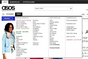
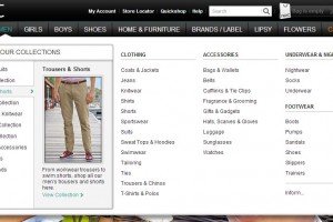
This has way more to do with the actual aesthetic design of the mega menu itself. If you render 15 categories across with a 2px font, 2px indent difference in their sub-items – you’ll bamboozle even the savviest shopper or information consumer; but utilizing top-level category images, distinct styling differentiators, and proportional whitespace & you’ll avoid this pretty well. Just look at the simple differences between ASOS and Next that make a HUGE impact on usability and ease.
Mega Menu Argument #4: Rendering a link on every page to every other page confuses relevancy signals and dilutes ‘Link Juice’
This one actually has a bit of validity with me. If you’re rendering your entire categorical hierarchy of products on every page and your menu contains upwards of 50 items this could effect SEO slightly. Especially when it comes to internal link structure, you’re essentially creating a relationship between every page and every other page on your website – this can be great if your website has a super-niche market but in the case of larger retailers like Next it means you’re associating Fireplaces with Pet Accessories.
A good strategy to solving this is a hybrid approach of initially loading the current category’s mega menu server-side to make sure you’re establishing those downstream related content link structure relationships and then loading any other category mega menus via AJAX which will minimize load time and maximize internal link structure relevancy.
Another thing to consider here is should you have a micro site specifically geared to selling these product categories, Magento and it’s Multi-site set-up option for example could be an effective solution to this.
Conclusion:
At the end of the day deciding whether a mega-menu is right for your eCommerce website or not has a lot to do with the shape of your product catalog & customer shopping behavior. If you want to give it a try do some AB testing.
If you really want to maximize your internal link structure and SEO within your menu, try shifting category and sub-category menu loading server-side – such that any page deeper than the root of the product catalogue renders crawlable anchor links just for its child pages. To the end user they’ll never know the difference besides a slightly quicker load of the downstream mega-menu and you’ll notice a bump in link juice without diluting it with the entire sitemap.
With all this being said, don’t spend too much time on trying to get accomplish something like this if you have much easier possible changes that could make a bigger difference to your SEO, customers buying experience and your overall conversions. Weigh up the pros and cons and consider if a mega menu should really be near the top of your development roadmap and list of jobs to complete or is something else much more important and going to have a much bigger effect!
















Recent Comments